Our 3d work has been a hallmark of our business, thus the name 3d Houston. In our 3d work, we strive for photo- realism. The customers that generally seek us out are architects, contractors and construction firms, engineering firms and oil companies. The real value of 3d rendering is to create a room, building, or object that does not yet exist. Many people have difficulty seeing what an object will look like. Stephen is our main modeler, and he has a keen sense for visualizing projects in their finished state. That, accompanied with software skills allows us to show you the finished product before breaking ground. Utilizing photo-real techniques, we can show you the structure at different times of day, sunny or cloudy. 3d modeling is also used to trial fit items before creating them in real life, saving time and the costs of trial and error. What can we help you build?
Architectural Exteriors
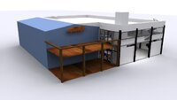 Exterior concept rendering of the Formula Garage featuring outside patios and a roof-top deck. The blue building is the existing structure.
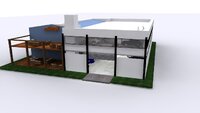 Secondary outside view of the Formula Garage.
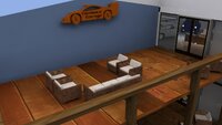 Conceptual layout of the Formula Garage patio area. Since these are still concepts, the detail was left out to save time and budget for the finalized project.
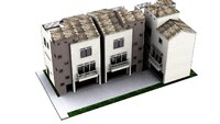 An inner-city housing development designed for zero-lot line construction. This type of housing has become very popular in downtown Houston.
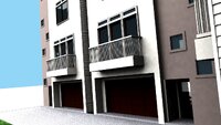 A closeup view from the driveway, shows some of the detail of the houses up close.
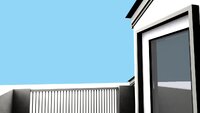 From the third floor porch, the residents will have a commanding view o the city.
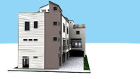 The street view of the GI project shows how the houses are positioned on the lot, and leaves a sense of seclusion and privacy in the city.
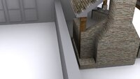 Unique Builders specializes in constructing patios and exterior kitchens. This project adds a fireplace, exterior television, and kitchen area. This is the exterior view.
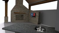 Here, we see the details of the fireplace and bar area.
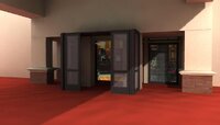 This is a rendering of the addition to a sliding glass door to an existing hotel structure.
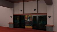 Hotel door remodel, second of its kind.
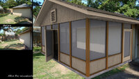 This is a pre-visualization quality rendering showing a back porch addition to the garage.
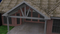 Here, the homeowner wanted to see what it would look like to add a roof to their existing patio.
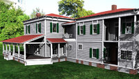 Here we featured the Edison Estate in a composite rendering featuring putting the model on an existing parcel of land, and simulating the shadows of existing trees.
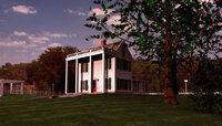 This house features a fabricated landscaping with simulated sun and shadowing of a summer sunset. Only the sky and treeline are real in this image.
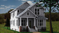 Here is a new house that was built in a historical neighborhood. The customer was able to select colors and materials before the construction was begun.
Interiors
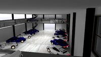 Interior second floor view. This is a concept for a new building, as viewed from the second floor.
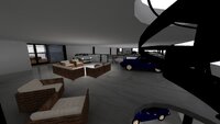 Socializing space. This view show the gathering area with access to the roof patio, the second floor patio, and the floor below.
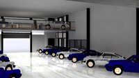 First floor view of the Formula Garage with layout for parking of approximately 20 cars.
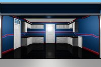 This project was to finish out the garage to match the car's striping and provide a comfortable, room-like quality to the garage. After several iterations, this was the final design.
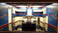 Here is a view of the garage after all construction, painting and finishing were completed. The owner was completely satisfied.
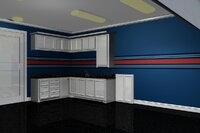 This is a cabinet detail rendering of the garage's cabinetry.
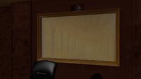 Here is a detail view of the TV with teleconferencing camera. In this view, the TV is displaying a painting, and the TV is framed to camouflage the technology.
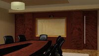 The main task on the conference room remodel was to add the needed A/V equipment while keeping the look and feel of the room non-technical. The wood panel wall was added to conceal the equipment, wires, storage, and provide the added capability.
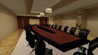 This is a view of the conference room from the opposite side of the room, showing visibility of the TV from the far end.
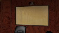 The customer asked for a version showing the TV without framing.
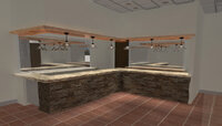 1st Capital wanted to see an installed bar would look like in an existing ballroom.
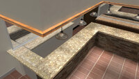 This is a secondary view of the bar addition.
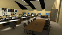 This rendering allowed the customer to try out some different room features before construction. In this version, the ceiling has curved panels to give the room a domed feel.
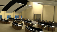 This is a view of the back of the control room with the arched panels, showing a single skylight.
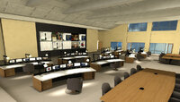 Here. the customer wanted to see the room with a beamed ceiling with several skylights, and second story windows. The room became much brighter, and this was the version that was ultimately built.
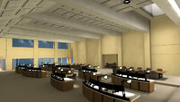 This is a view of the back of the control room with the new ceiling design.
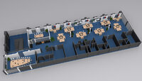 Aerial views are very popular with office remodels. Grey areas depict existing rooms that will not be changed.
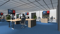 Here is a view of the main area in Office 9. The customer picked out specific furniture and chairs, which we modeled from scratch. The result is an exact and authentic looking room image.
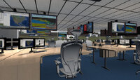 Here is a view of the main area in Office 10. This room is in the same building as Office 9, and looks remarkably the same, but is actually a different area.
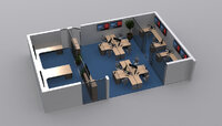 We did several remodels with this company. Here, we showed the remodel of a support room. The same design and colors were carried through.
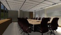 In this conference room, the furniture style and layout was the most important part of this job.
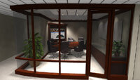 Conference Room 15 has this beautiful glass and wood walls, and features 2-way teleconferencing equipment.
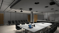
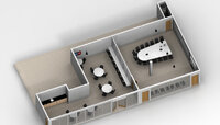 Aerial view. We did several revisions- at least 8- on this project. The customer was able to try different equipment, room layouts, utility room configurations. They ended up saving thousands on construction, and ended up with a well configured room in which all the equipment fit.
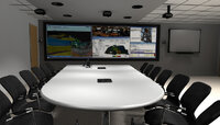 This image shows the main conference area, with the final ceiling and projector configuration.
 Here is the room view that shows what the teleconferencing camera would see.
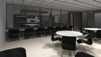 This room features and observation/break room. Using these images, the company was able to have a precise building plan that eliminated the mysteries from the end result.
Specialized Graphics
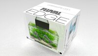 ADG came to us with a need to display a product box which had not yet been made. Using our photo real techniques, we created and animated this box. Look in the Animation section for the animated version.
 In order to try out different paint schemes, we built this model of a Super Viking aircraft for Tri-Star Aviation. We have the experience to build complex geometry accurately.
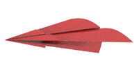 This paper airplane was built for Theresa Devine, fine artist. She needed 3d modeled paper airplanes so she could have them in different views easily. Also, she branched into interactive artwork, and has animated versions of this airplane and other artwork which we made models for.
 This little bus was modeled years ago to show our versatility, and became a sort of unofficial mascot of 3d Houston. Alas, its days of logo level attention have passed, but we still want to show this great little model.
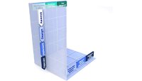 Powerpoint charts not quite cutting it for you? This is a piece we built for a presentation for one of our oil field customers. We can create beautiful, one of a kind graphics that will make you stand out.
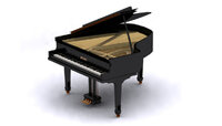 Steve also has a DIY show, The American Garage, and loves to take on unusual projects. One such project was the restoration of a grand piano. As part of the learning process, we made this piano, and later animated it for our Christmas Greeting.
 This beautiful graphic was used as an illustration in the annual report the HFB publishes internally.
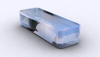 We built this simple plastic box as a prototype that was later manufactured for use in science laboratories. In addition to the renderings, we provided 3d Autocad files to the factory for manufacturing.
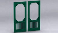 This project allowed the customer to see how the design of the screen door would work with the house. Since it is a historic house, detail was critical. We used architectural cue on the house itself to come up with the design. Being an avid woodworker, Steve actually made these doors once the customer settled on the final design.
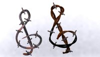 We made this logo for the Young Texas Artists music competition, which they proudly display on their website today at www.ytamc.com
 A customer in the medical field wanted a specialized graphic to illustrate cooperation and growth. We came up with this simple and clean graphic for their powerpoint presentation.
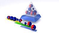 Additional graphics were made to augment a powerpoint.
Animations
We have done some nice animations-go to the Animations page to view-


